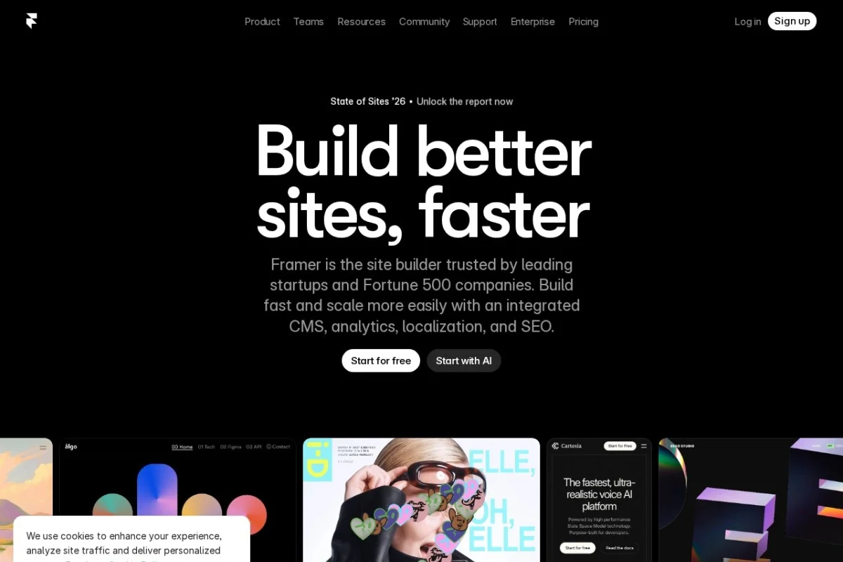
Introduction to Framer: A Visual Web Builder for Modern Websites
In the rapidly evolving world of web design, the line between design and development continues to blur. Framer stands at the forefront of this revolution, offering a powerful yet intuitive platform that allows anyone—from seasoned designers to complete beginners—to build, prototype, and publish fully responsive websites without writing a single line of code. Originally known as a prototyping tool for designers, Framer has transformed into a full-fledged web builder that combines the freedom of a visual canvas with the rigor of professional publishing tools.
At its core, Framer is a drag-and-drop website builder that excels in creating highly interactive and animated websites. Unlike traditional builders that often feel restrictive, Framer gives you complete control over every pixel, movement, and interaction. Whether you are building a personal portfolio, a business landing page, or a content-rich blog, Framer provides the tools to make your site stand out. The platform also includes a built-in Content Management System (CMS), search engine optimization (SEO) tools, and reliable hosting, meaning you can design, manage, and launch your website from a single dashboard.
This tutorial is designed to be your comprehensive guide to Framer. We will walk through the initial setup, explore the key features that make Framer unique, and provide a step-by-step guide on how to build your first project. By the end, you will have the confidence to create a professional, animated, and responsive website—all without needing to understand CSS, JavaScript, or HTML.
Getting Started with Framer
Before you can start building, you need to set up your Framer account and familiarize yourself with the workspace. The process is straightforward and designed to get you into the creative flow as quickly as possible.
Creating Your Account
Navigate to the official Framer website at https://www.framer.com. Click the “Get started for free” button. You can sign up using your Google account, Apple ID, or a dedicated email address. Framer offers a generous free tier that allows you to build and publish a site on a Framer subdomain (e.g., yoursite.framer.app). This is perfect for learning the platform and testing your designs before upgrading to a paid plan for a custom domain.
Understanding the Framer Interface
Once you log in, you will be greeted by the project dashboard. This is your command center. Here is a breakdown of the main areas:
- The Project List: This shows all your existing projects. You can create a new project by clicking the “Create Project” button.
- The Toolbar (Top): When you open a project, the top toolbar contains tools for adding elements (Text, Image, Video, Button), undo/redo, previewing your site, and publishing.
- The Canvas: This is the main white workspace where you design your website. You can click and drag elements directly onto the canvas.
- The Layers Panel (Left): This panel shows a hierarchical list of every element on your page. It is essential for organizing complex designs and selecting elements that are hidden behind others.
- The Properties Panel (Right): This is where you control the details. When you select an element on the canvas, this panel changes to show its specific settings—size, color, font, spacing, animation, and interactions.
Starting Your First Project
From the dashboard, click “Create Project.” You will be asked to choose a template or start from a blank canvas. For this tutorial, we recommend starting with a blank canvas to learn the fundamentals. Give your project a name, such as “My First Framer Site,” and click “Create.” You are now in the Framer editor.
Key Features of Framer
Framer’s power lies in its unique combination of features. Understanding these will help you leverage the platform to its full potential.
Visual Drag-and-Drop Website Builder
This is the heart of Framer. You can add any element—text blocks, images, buttons, videos, or even entire sections—by dragging them from the toolbar onto the canvas. The layout is fully flexible. You can position elements with pixel-perfect accuracy using the Properties Panel, or you can let Framer’s auto-layout system handle responsive spacing for you. The grid and snapping guides make aligning elements effortless.
Advanced Animations and Interactions
Framer was originally a prototyping tool, and this heritage is evident in its animation engine. You can add motion to almost anything. Key animation features include:
- Page Transitions: Animate how pages slide, fade, or scale when a user navigates between them.
- Scroll Animations: Trigger animations based on how far the user has scrolled. Elements can fade in, slide up, or rotate as they enter the viewport.
- Hover and Click Effects: Change an element’s color, scale, or position when a user hovers over it or clicks it.
- Variants: Create multiple visual states for a single component (e.g., a button that looks different when idle, hovered, or clicked) and animate between them.
Built-in CMS and SEO Tools
Framer is not just for static sites. The built-in CMS allows you to create dynamic content collections. For example, you can create a “Blog Posts” collection, define fields like “Title,” “Author,” and “Body Text,” and then design a template that automatically pulls data from these fields. This makes updating content easy without editing the design. For SEO, Framer provides a dedicated panel where you can edit meta titles, descriptions, and Open Graph images for every page, helping your site rank better in search engines.
Responsive Design Across Devices
Modern websites must look good on desktops, tablets, and phones. Framer handles this through a “Breakpoints” system. You can design your layout for a desktop screen, then switch to a tablet or mobile view. Framer will intelligently adjust your layout, but you can also manually tweak the position and size of elements for each device size. This ensures your site is truly responsive.
Publishing with Custom Domain or Subdomain
When you are ready to go live, Framer makes publishing simple. The free plan allows you to publish instantly on a Framer subdomain (e.g., yoursite.framer.app). Paid plans let you connect a custom domain (e.g., www.yoursite.com). Framer handles all the hosting, SSL certificates, and CDN delivery, so your site loads quickly and securely.
How to Use Framer: A Step-by-Step Guide
Let’s build a simple one-page portfolio website to put these features into practice.
Step 1: Setting Up the Page Structure
On your blank canvas, you will see a default “Page” layer in the Layers Panel. Click on the page to select it. In the Properties Panel on the right, set the background color to a light gray (e.g., #F5F5F5). Now, we will add sections. Click the “+” icon in the top toolbar, then drag a “Section” component onto the canvas. This creates a full-width container. Rename this section “Hero” in the Layers Panel. Add two more sections below it and name them “About” and “Contact.”
Step 2: Designing the Hero Section
Select the “Hero” section. Drag a “Text” element into it. Type your name, for example, “Jane Doe.” In the Properties Panel, change the font size to 72px, the font weight to bold, and the color to black. Below this, drag another text element and type “Designer & Developer.” Set this font size to 24px and the color to a muted gray. Finally, drag a “Button” element below the text. Change the button label to “View My Work.” Set the button’s background color to your brand color (e.g., a deep blue) and the text color to white. Center all elements horizontally using the alignment tools in the Properties Panel.
Step 3: Adding a Scroll Animation
We want the hero text to fade in when the page loads. Select the main text element (“Jane Doe”). In the Properties Panel, scroll down to the “Effects” section. Click “Add Effect” and choose “Fade In.” Set the duration to 1 second. Now, select the button. Add a “Slide In” effect from the bottom, with a duration of 1.2 seconds and a delay of 0.5 seconds. This creates a staggered, professional entrance.
Step 4: Building the About Section
Select the “About” section. Add an “Image” element and upload a photo of yourself. Place it on the left side of the section. On the right side, add a text element with the heading “About Me” (set to 36px bold) and a paragraph element with a short biography. Select both the image and the text block, and in the Properties Panel, set the layout to “Horizontal” with space between them. This creates a clean two-column layout.
Step 5: Creating a Contact Form
Select the “Contact” section. Add a text heading “Get in Touch.” Below it, drag an “Input” element from the toolbar. This creates a text field. Change the placeholder text to “Your Name.” Add another input for “Your Email.” Finally, add a “Text Area” element for the message. Add a “Submit” button below the form. You can connect this form to a service like Formspree or Web3Forms for functionality, but for now, you have a beautiful, styled form ready to go.
Step 6: Making It Responsive
At the top of the canvas, you will see device icons: Desktop, Tablet, and Phone. Click the “Phone” icon. You will notice that your two-column “About” section might look cramped. On the phone view, select the container holding the image and text. Change its layout from “Horizontal” to “Vertical.” The image will now stack above the text. Adjust font sizes and padding for smaller screens as needed. Repeat this process for the Tablet view.
Step 7: Publishing Your Site
Once you are satisfied with the design, click the “Publish” button in the top right corner. A panel will appear. Choose “Publish to Framer Domain.” Your site will be live in seconds at a URL like “myfirstframer-site.framer.app.” You can share this link with anyone. If you have a paid plan, you can also add a custom domain here.
Tips for Mastering Framer
To get the most out of Framer, keep these practical tips in mind as you continue building.
Use Components for Reusability
If you have a navigation bar, footer, or button style that appears on multiple pages, turn it into a “Component.” Right-click the element and select “Create Component.” Now, any changes you make to the master component will automatically update everywhere it is used. This saves immense time and keeps your design consistent.
Leverage Auto-Layout for Spacing
Instead of manually positioning every element with X and Y coordinates, use Framer’s Auto-Layout feature. When you select a container, enable Auto-Layout. You can then set padding, gap, and direction (horizontal or vertical). This makes your layout flexible and much easier to maintain, especially when adding or removing elements.
Master the Variants Panel
Variants are Framer’s superpower for interactions. Select a button, open the “Variants” panel (usually a tab next to Properties), and create a new variant called “Hover.” Change the button’s scale to 1.05 and its shadow. Then, in the Prototype tab, connect the “Default” variant to the “Hover” variant with a “While Hovering” trigger. You now have a polished, interactive button.
Optimize Images for Speed
Large image files can slow down your site. Before uploading images to Framer, compress them using a tool like TinyPNG or Squoosh. Framer will also automatically serve images in modern formats like WebP, but starting with a smaller file size ensures the fastest possible load times.
Explore Templates for Inspiration
If you feel stuck, do not start from scratch. Framer offers a library of professionally designed templates for portfolios, businesses, and blogs. Browse the template library, duplicate one you like, and then modify it. This is a fantastic way to learn advanced layout techniques and animation styles.
Test on Real Devices
While Framer’s built-in responsive preview is excellent, always test your published site on a real phone and tablet. Touch interactions can feel different than mouse clicks. Ask friends to test your site to catch any layout bugs or broken links before you share it widely.
Framer is a tool that rewards experimentation. Do not be afraid to break things and try new effects. The visual nature of the platform means you can see the results of your actions instantly, making it one of the fastest ways to learn modern web design. Start with a simple project, master the basics of layout and animation, and soon you will be building complex, professional websites that rival anything created with traditional code.
