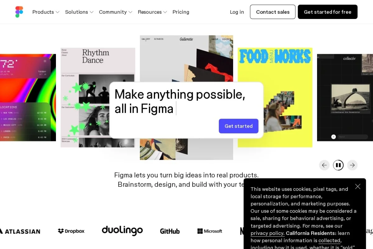
Introduction to Figma: The Cloud-Based Design Powerhouse
Welcome to the world of Figma. If you are a designer, product manager, developer, or anyone involved in creating digital products, Figma is likely the most important tool you will learn this year. Unlike traditional design software that requires powerful computers and constant file saving, Figma lives entirely in your web browser. This fundamental shift means that your design files are always accessible, always up-to-date, and always collaborative.
Figma is not just a drawing tool; it is a complete design platform. It allows you to create high-fidelity user interfaces, build interactive prototypes, manage complex design systems, and hand off your work to developers—all within a single ecosystem. The core magic of Figma lies in its real-time collaboration engine. Multiple people can work on the same file simultaneously, seeing each other’s cursors and changes as they happen. This eliminates the chaos of sending “final_v3.sketch” files back and forth via email.
In this tutorial, you will learn everything you need to start using Figma effectively. We will cover the basics of setting up your account, navigating the interface, understanding the key features that make Figma unique, and practical steps to create your first design. By the end, you will understand why Figma has become the industry standard for UI/UX design and how you can leverage its power for your own projects.
Getting Started with Figma
Creating Your Account and Setting Up
Getting started with Figma is remarkably simple. First, navigate to https://www.figma.com. Click the “Get started for free” button. You can sign up using your Google account, your Apple ID, or an email address. Figma offers a generous free tier that is perfectly suitable for individuals and small teams. This free plan includes unlimited files, unlimited cloud storage, and up to three Figma projects.
Once you have signed up, you will land on the Figma dashboard. This is your home base. On the left side, you will see your “Drafts” folder, which is your personal space for files that are not shared with anyone. In the center, you will see recent files. To start a new project, click the “+” icon in the top left corner or click the “New design file” button. This will open a blank canvas where the magic happens.
Understanding the Figma Interface
The Figma interface is clean and purpose-built for design work. Let’s walk through the main areas you need to know:
- The Toolbar (Top): This is where you find the essential tools. The most important are the Move Tool (V), the Frame Tool (F), the Shape Tools (Rectangle, Ellipse, Line), and the Text Tool (T). You will use these constantly.
- The Layers Panel (Left): This panel shows the structure of your design. Every object you create appears here. You can rename, reorder, group, and nest layers within each other. Think of it as the table of contents for your design file.
- The Canvas (Center): This is your infinite workspace. You can zoom in and out using Ctrl + Mouse Wheel (Windows) or Cmd + Mouse Wheel (Mac). Hold the spacebar and click and drag to pan around the canvas.
- The Properties Panel (Right): This panel changes based on what you have selected. If you select a shape, you can change its fill color, stroke, corner radius, and shadow. If you select text, you can change the font, size, and alignment. This is where you fine-tune every detail of your design.
- The Prototype Tab (Top Right): Next to the “Design” tab, you will see the “Prototype” tab. This is where you connect different frames together to create interactive flows.
Key Features of Figma
Real-Time Collaboration
This is Figma’s headline feature. When you share a file with a colleague, both of you can edit the same layers at the same time. You will see their cursor with their name attached. Changes appear instantly. This is not just for designers; product managers can leave comments directly on the canvas, and developers can inspect elements without interrupting the designer. This feature alone saves hours of back-and-forth communication.
Vector Editing and Prototyping
Figma includes a powerful vector editing engine similar to Adobe Illustrator but optimized for screen design. You can create complex icons, illustrations, and UI elements using the Pen Tool (P) and Boolean operations (Union, Subtract, Intersect). The prototyping tools allow you to connect frames with interactive triggers like “On Click,” “While Hovering,” or “After Delay.” You can create realistic app flows and share them as a clickable prototype via a simple link.
Design System and Component Management
Consistency is critical in design. Figma allows you to create “Components” – reusable design elements like buttons, input fields, and navigation bars. When you edit a “Main Component,” all “Instances” of that component across your file update automatically. You can also create “Styles” for colors, text, and effects. This forms the foundation of a Design System, ensuring that your entire product looks cohesive.
Developer Handoff with Inspect Mode
Once your design is ready, developers need to extract information like colors, font sizes, spacing, and exact measurements. Figma’s “Inspect” mode does this automatically. Developers click on any layer, and the right panel shows them the CSS code, the dimensions, and the export settings. They can copy the code directly, which reduces the gap between design and development.
Version History and Branching
Ever made a change and wished you could go back? Figma saves your version history automatically. You can access it by clicking the dropdown arrow next to the file name at the top of the screen. You can name specific versions (e.g., “Homepage v2 – Final”) and restore any previous version instantly. The newer “Branching” feature allows you to create a separate branch of a file to experiment with big changes without affecting the main design, similar to how developers use Git.
How to Use Figma: A Practical Step-by-Step Guide
Step 1: Creating Your First Frame
When you open a new design file, you will see an empty canvas. The first thing you need to do is create a “Frame.” Frames are the equivalent of artboards in other software. They define the boundaries of your screen or device.
- Click the Frame Tool (F) in the toolbar.
- In the right Properties Panel, you will see a list of preset sizes. Choose “iPhone 14 Pro Max” or “Desktop” depending on what you are designing. Simply click one, and a frame will appear on the canvas.
- You can also click and drag on the canvas to draw a custom-sized frame.
Step 2: Adding Basic UI Elements
Now let’s build a simple mobile login screen.
- Select the Rectangle Tool (R) and draw a rectangle inside your frame. In the Properties Panel on the right, set the fill color to a brand color (e.g., blue #1877F2). This will be your primary button.
- Select the Text Tool (T) and click inside the rectangle. Type “Log In”. In the Properties Panel, set the font to “Inter”, size to 16, and color to white. Center the text using the alignment buttons.
- Add a text layer above the button for the title. Type “Welcome Back”, set the font size to 28, and make it bold.
- Add two more rectangles below the title to simulate text input fields. Give them a light gray fill (#F0F0F0) and a small corner radius (8px).
- Add text labels next to these fields: “Email” and “Password”.
Step 3: Using Auto Layout for Responsive Design
One of Figma’s most powerful features is Auto Layout. It makes your designs responsive and saves you from manually adjusting spacing.
- Select the rectangle you made for the “Log In” button.
- In the Properties Panel, find the “Auto Layout” section and click the “+” icon next to it. You will see a purple box appear around your button.
- Now, when you add padding (the space inside the button), the button will grow automatically. Set horizontal padding to 24 and vertical padding to 12.
- Try adding more text inside the button. The button will expand to fit the text. This is the magic of Auto Layout.
Step 4: Creating a Component (Reusable Element)
Let’s turn your button into a reusable component.
- Right-click on the “Log In” button (the one with Auto Layout).
- Select “Create Component” from the menu. You will see a diamond icon appear next to the layer name in the Layers Panel.
- Now, press Ctrl + D (Cmd + D on Mac) to duplicate the button. You now have an “Instance” of the component.
- Double-click the text in the new instance and change it to “Sign Up”. Notice that the original button remains unchanged. This is how you maintain consistency while customizing instances.
Step 5: Adding Interactions (Prototyping)
Now let’s make your screen interactive.
- Create a second frame on the canvas. Make it a “Home Screen” by adding a simple header and some placeholder text.
- Go back to your login frame. Select the “Log In” button.
- Click the “Prototype” tab in the top right corner of the Properties Panel.
- Click the small circle icon (the “connection point”) on the right side of the button. A wire will appear.
- Drag the wire to the “Home Screen” frame you created.
- In the interaction settings that appear, keep the trigger as “On Click” and the action as “Navigate to”.
- Click the “Play” button in the top right corner of the toolbar. Figma will open a new tab with your interactive prototype. Click the “Log In” button to see the transition.
Step 6: Sharing and Developer Handoff
To share your design with a developer or stakeholder:
- Click the “Share” button in the top right corner of the Figma window.
- Copy the link. Anyone with the link can view the prototype or inspect the design.
- For developers, tell them to open the file and select a layer. They can then click the “Inspect” tab in the right panel to see all the code and measurements they need.
Tips for Getting the Most Out of Figma
Master Keyboard Shortcuts
Figma is built for speed. Learning a few shortcuts will dramatically increase your efficiency. Here are the essentials:
- V: Move Tool
- F: Frame Tool
- R: Rectangle Tool
- T: Text Tool
- Ctrl + G: Group selected layers
- Ctrl + Shift + G: Ungroup layers
- Ctrl + D: Duplicate selected layer
- Alt + Drag: Duplicate an object quickly
- Ctrl + /: Search for any menu command or plugin
Use the Grid and Layout Tools
Good design relies on alignment. Always use the Layout Grid feature. Select a frame, go to the Properties Panel, and under “Layout Grid,” add a grid (e.g., 8-column grid for desktop). This will help you place elements consistently. Also, use the Smart Selection feature: when you select multiple objects, Figma shows you the spacing between them. You can type a number to set exact spacing instantly.
Leverage Community Resources and Plugins
You do not have to design everything from scratch. Figma has a massive Community section where users share free UI kits, icons, and templates. Go to the main Figma dashboard, click “Community,” and search for “Material Design Kit” or “Free Icons.” Additionally, install plugins for tasks like removing backgrounds from images (Remove BG plugin), generating dummy text, or exporting assets in multiple sizes.
Organize Your Layers and Pages
As your file grows, organization becomes critical. Use the Pages feature (bottom left of the Layers Panel) to separate different parts of your project. For example, create separate pages for “Login Flow,” “Dashboard,” “Settings,” and “Component Library.” Inside each page, name your layers descriptively (e.g., “Primary Button” instead of “Rectangle 47”). This makes it easier for collaborators and for your future self.
Use Constraints for Responsive Design
When you resize a frame, the elements inside it might not behave as expected. To fix this, select an element and look at the Constraints section in the Properties Panel. By default, elements are pinned to the top-left corner. If you want a button to stay centered when the screen resizes, set the constraints to “Center” for both horizontal and vertical axes. This is essential for designing responsive websites.
Collaborate with Comments
Instead of sending feedback in separate emails, use Figma’s comment feature. Press C on your keyboard to activate the comment tool, then click anywhere on the canvas. Type your feedback and press Enter. The comment will appear as a pin on the design. You can reply to comments and mark them as resolved. This keeps all feedback in one place.
Regularly Save Version History
While Figma saves versions automatically, it is a good habit to manually save a version before making major changes. Click the file name at the top, go to “Version History,” and click the “Save” button. Give it a descriptive name like “Before Redesign – Old Layout.” This gives you a safety net to revert if something goes wrong.
Conclusion
Figma is more than just a design tool; it is a collaboration platform that has transformed how digital products are built. By starting with the basics—creating frames, using Auto Layout, and mastering components—you can quickly move from a blank canvas to a polished, interactive prototype. Remember that the Figma community is vast and supportive; there are countless tutorials, templates, and plugins available to help you grow.
Your first few designs will be slow, and that is perfectly normal. Focus on learning one feature at a time. Start with simple screens, add interactions, and gradually explore more advanced topics like variables, design tokens, and branching. With consistent practice, you will find that Figma becomes an extension of your thinking, allowing you to design and iterate faster than ever before.
Now, open your browser, log into Figma, and start creating. The only way to master it is to use it.